An award-winning evening for Think!


Charlotte Wensley
Permalink

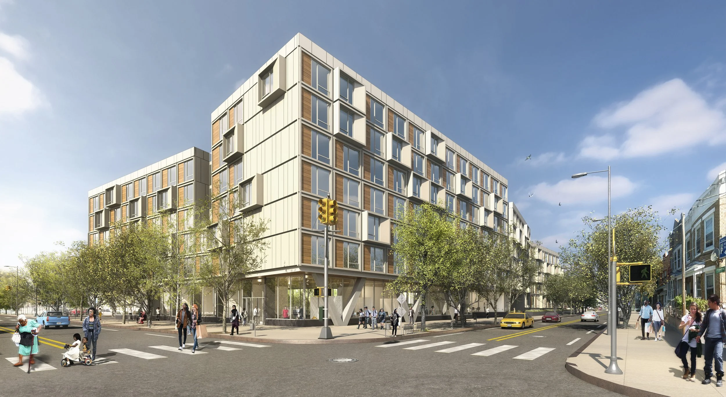
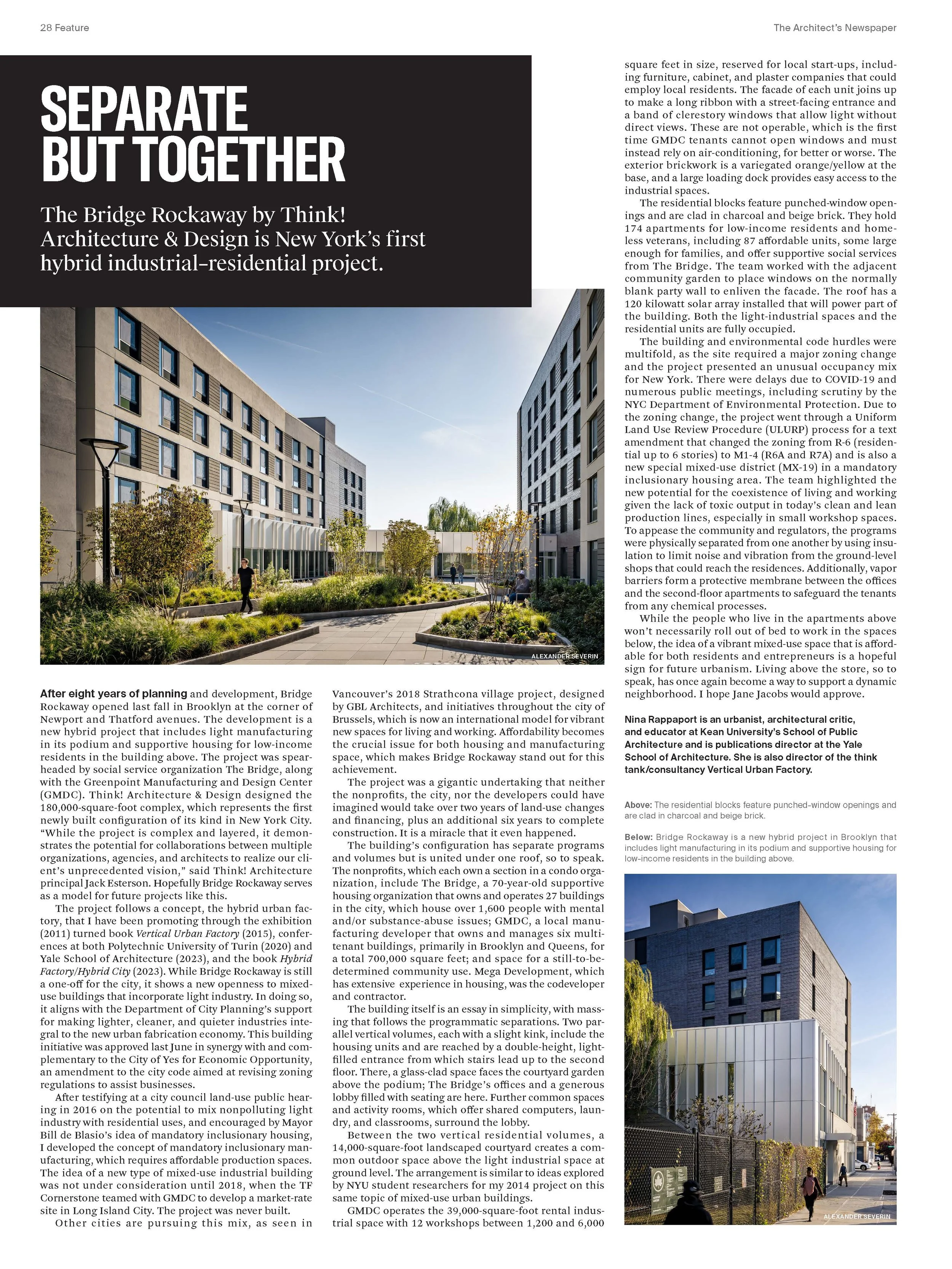
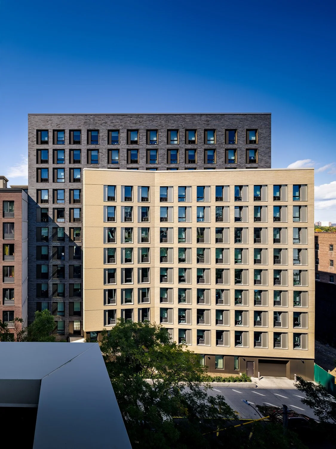
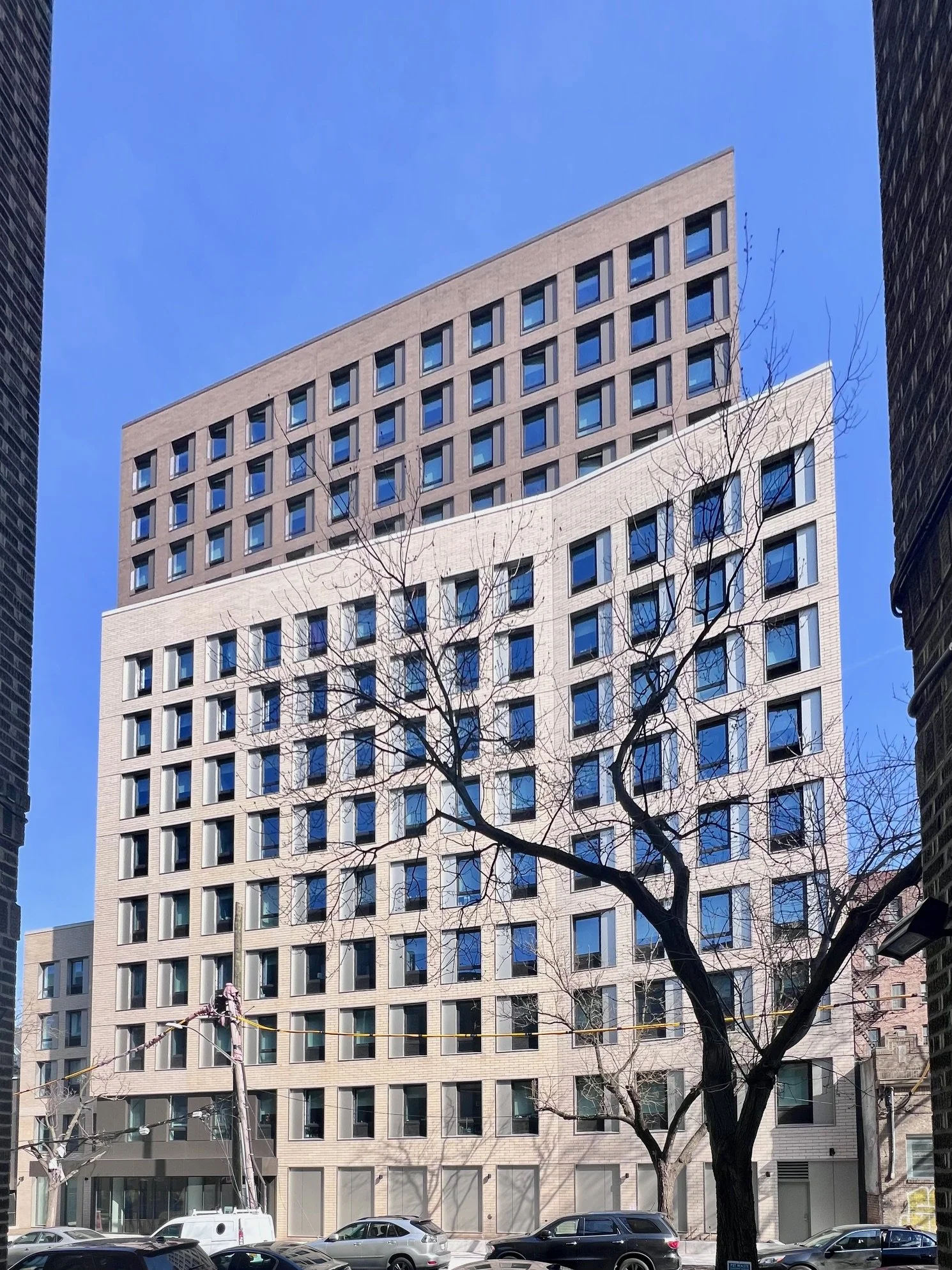
The New York State Association for Affordable Housing (NYSAFAH) presented its annual Awards for Excellence and Innovation in Affordable Housing Development last week. The Bridge Rockaway in Brooklyn designed by Think! for Mega Development, The Bridge and Greenpoint Manufacturing Design Center was awarded as Downstate Project of the Year.

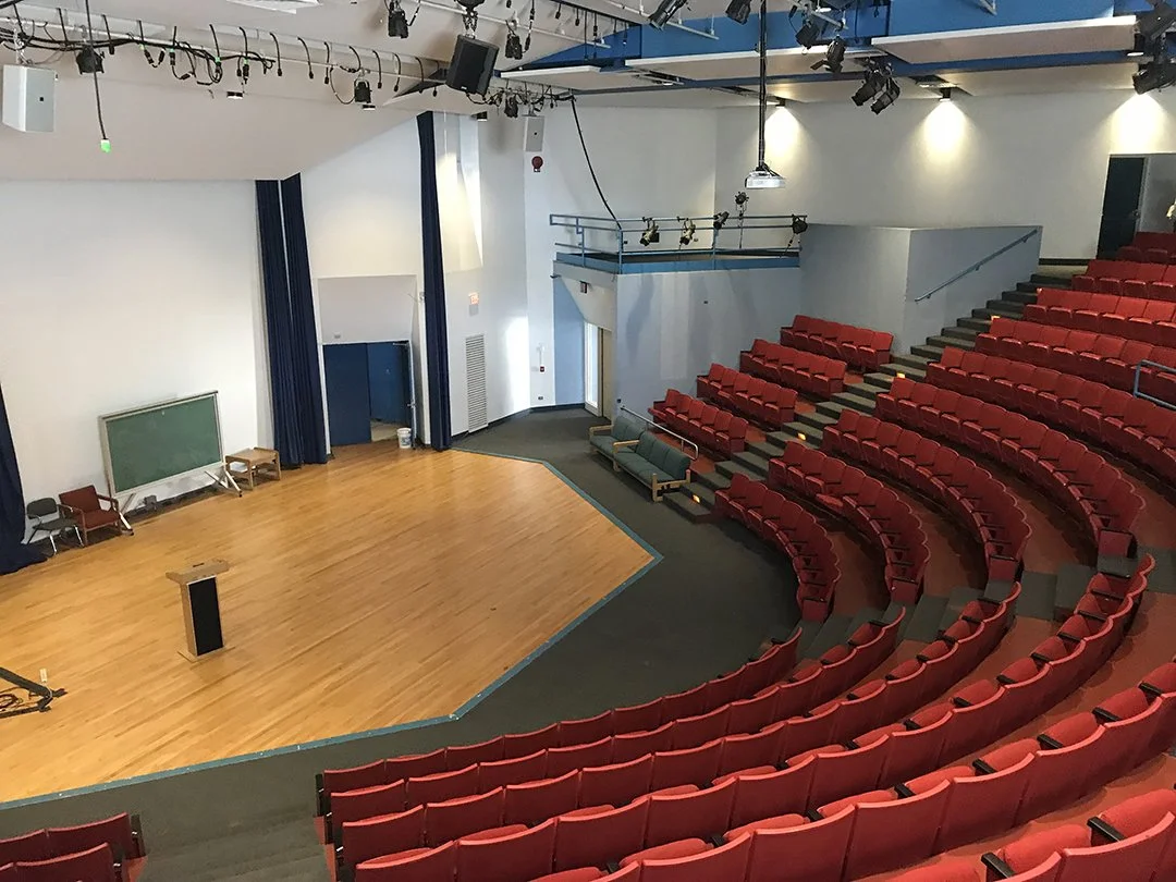
At a separate event a few miles away, Think!’s design for the Duane L Jones Recital Hall at SUNY Old Westbury was commended in the education category of the AIA Long Island’s Archi awards.

The Bridge Rockaway Team collect their awards from representatives of NYSAFAH and HPD

Game Arts Studio completed at Pratt Institute


Charlotte Wensley
Permalink

We recently completed the creation of a Game Arts Studio for Pratt Institute. The project responds to the introduction of a new Game Arts BFA and converted existing academic office space within Myrtle Hall - also designed by Think! - into a dedicated 7,100 sq ft state-of-the-art studio.

The Game Arts program represents Pratt’s recognition of how digital media is affecting the creative arts landscape and responding to what incoming students are gravitating towards. Think! has been instrumental in this critical academic transition, beginning in 2011 with the Digital Arts program, designing an advanced facility (Myrtle Hall) that tripled enrollment in one year, followed by the Department of Film and Video in 2019 and now the Game Arts Studio. Again, enrollment is explosive causing Pratt to plan a doubling of the studio space in the near future.

The Game Arts Studio was conceived as a free-form, deep space environment that is designed to highlight the kinetic video displays and on-screen work of our future video artists.  The space includes access to cutting-edge technology, collaboration pods and communal areas with soft seating to foster a more casual interaction between students.

Ribbon cutting at The Bridge: Co-locating affordable housing and light manufacturing


Charlotte Wensley
Permalink

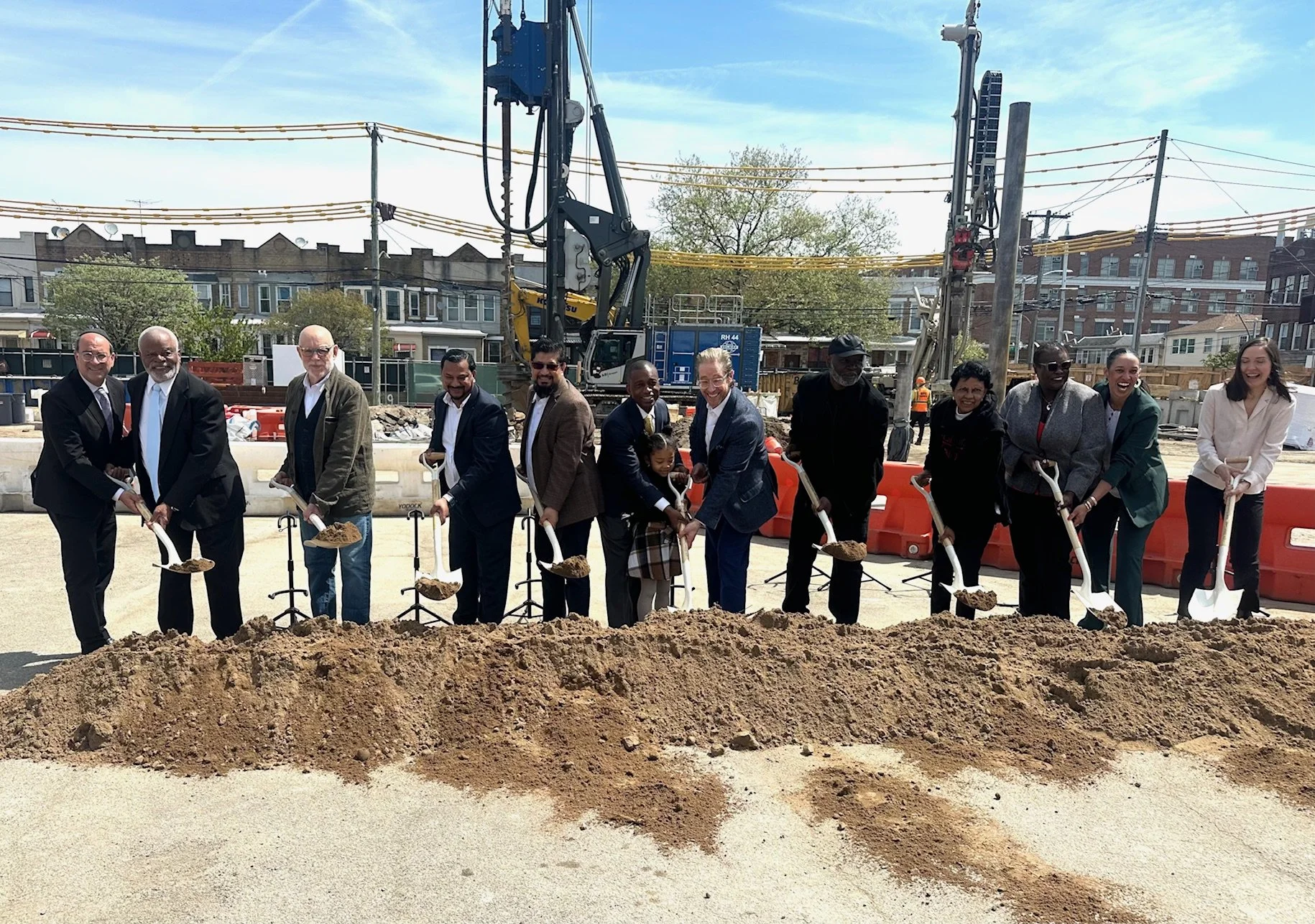
On September 25, 2024, the ribbon cutting ceremony took place at 203 Newport Street in Brownsville, Brooklyn, seeing nearly eight years of efforts to create a unique mix of uses come to fruition. The first of its kind in New York City, the project co-locates affordable housing with light manufacturing workshops.

Designed by Think!, this remarkable project is a collaborative effort involving The Bridge, a prominent supportive housing and behavioral health non-profit; Mega Development with its long history with affordable housing; and Greenpoint Manufacturing and Design Center (GMDC), a non-profit whose mission is to promote high-paying manufacturing jobs in under-served communities.

Members of the 203 Newport Street development team from The Bridge, Mega Development, GMDC and Think!

This new model of mixed-use has never been done in New York - the new zoning uniquely allows for residential units to sit above the manufacturing space - and took years of negotiation with a multitude of City agencies to insure the safety and comfort of the hundreds of people who will call this innovative complex home.

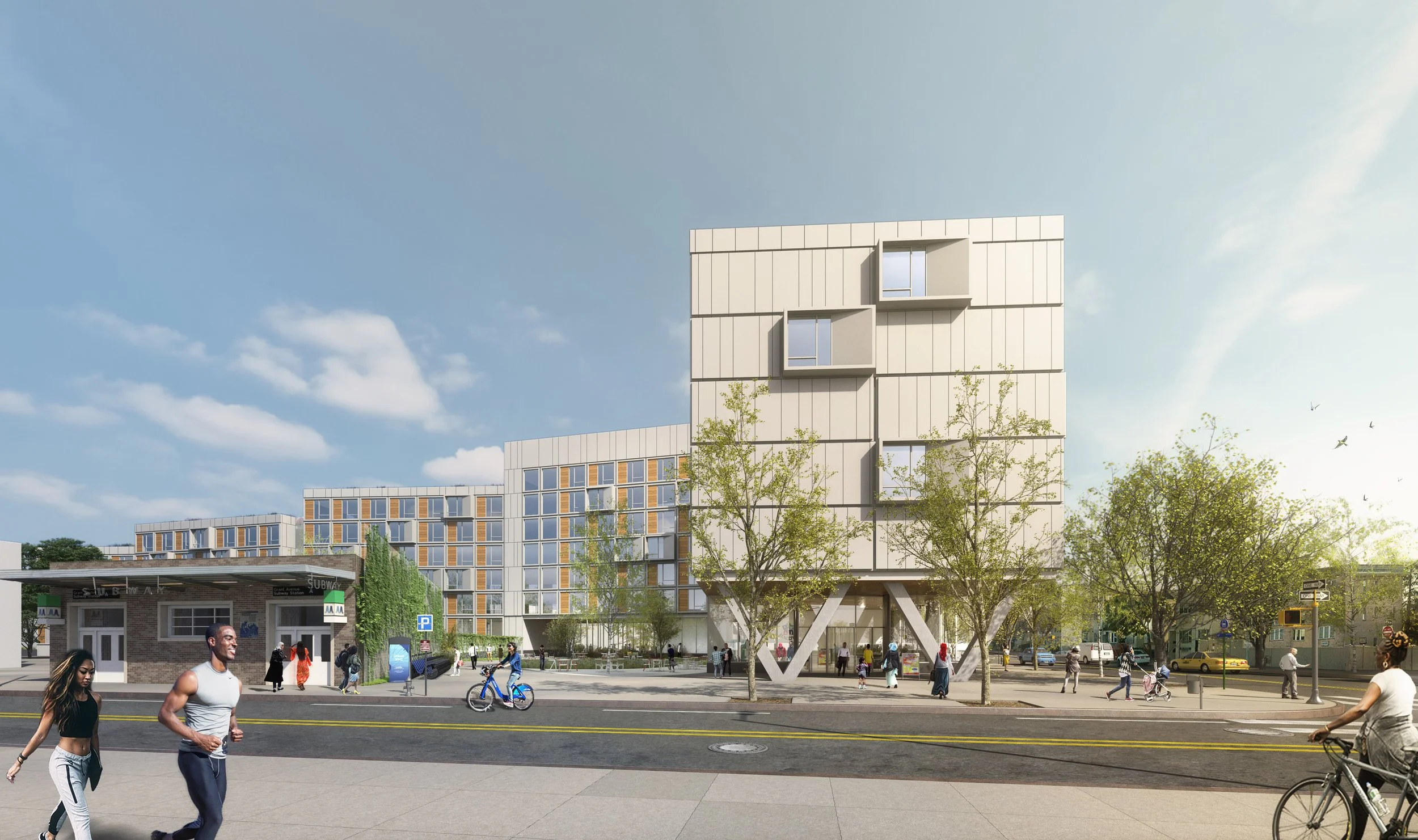
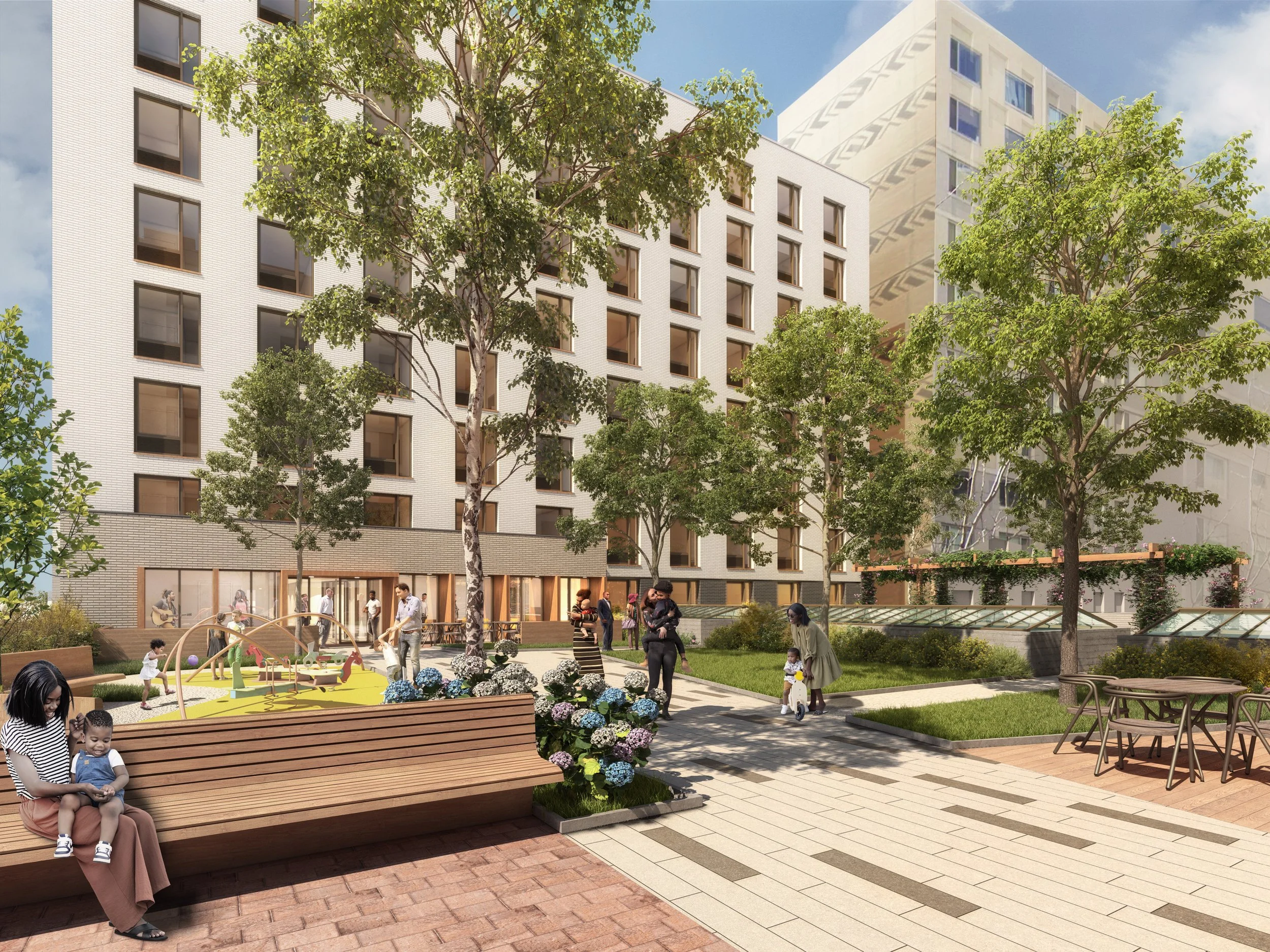
The result is a 180,000 square foot development that includes 174 mixed affordable and supportive housing units for low-income families, with 87 units set aside for homeless individuals and, of those, 35 for frail seniors and veterans. They are accommodated in two residential buildings of 5 and 6 stories flanking a 14,000 square foot landscaped courtyard and set above a shared single-story podium. The podium houses 40,000 sq ft light manufacturing workshop space designed as low-cost incubator spaces for local start-up companies.

The large garden and a glass link connecting the buildings serve as a social nexus to foster interaction among residents. The manufacturing component occupies almost the entire ground floor, making the second floor garden level the principal amenity floor. Think! took advantage of this condition, making the main entrance an unusually grand, two story space with a broad stair leading from the street to the garden. This welcoming and light-filled entry sequence is rarely seen in affordable housing, known for minimum standard spaces, and is designed to encourage social interaction, movement and better physical and mental health outcomes.

This elegant complex aspires to raise the bar for architecture in Brownsville and this new model is a milestone for this partnership, for Brooklyn and for all of New York. It has taken patience, collaboration, creativity and goodwill to shepherd the project to completion and it will hopefully pave a way for future similar developments that seek to address the City’s housing goals and also its workforce and economic goals.

Betances Family Apartments in Mott Haven, Bronx opens


Charlotte Wensley
Permalink

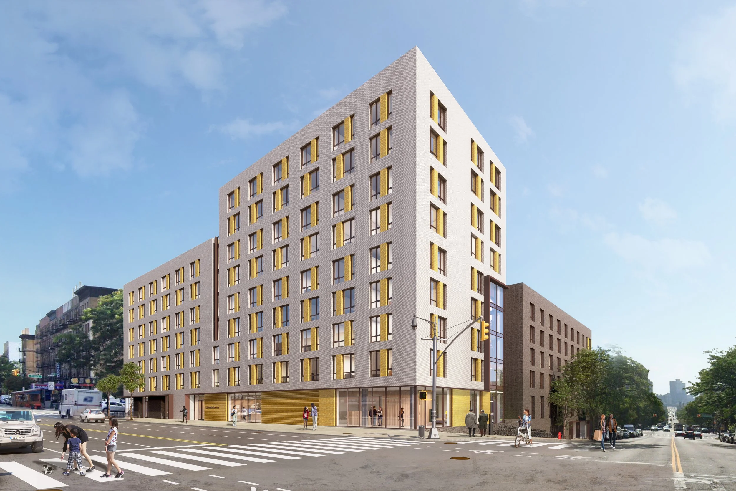
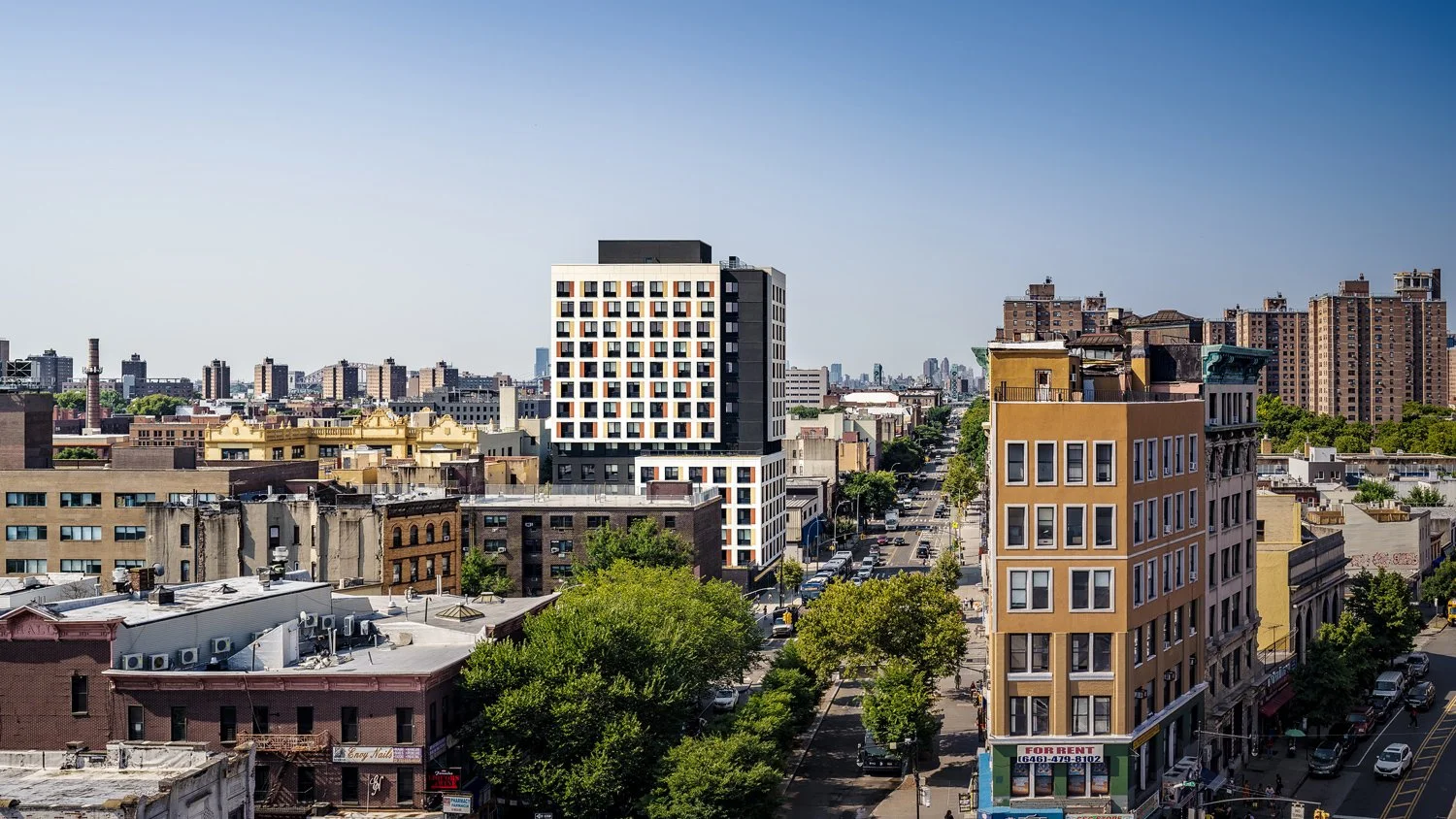
Betances Family Apartments in the Bronx’s Mott Haven neighborhood has opened, offering 101 deeply affordable homes.  Designed by Think! for Lemle & Wolff Development Company, Alembic Community Development and The Bridge, the 15 story, 98,000 sq ft development on the NYCHA Betances site 6 includes 70 units for low to moderate-income families with 30 set aside for previously homeless individuals.

Elected and city officials join the project team for the opening of Betances Family Apartments.

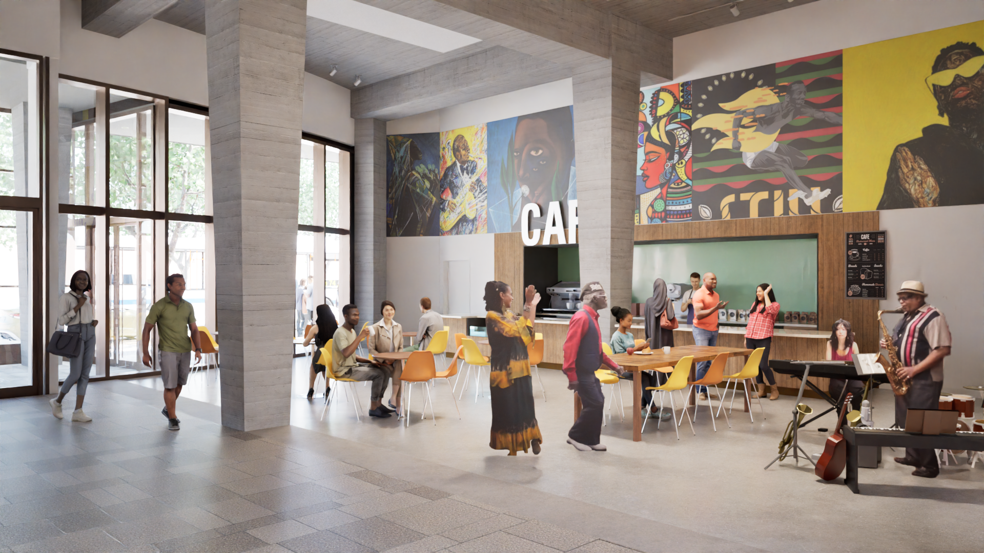
In addition to the apartments which range from studios to three bedrooms, the building features amenities such as a children’s playroom, bike storage, 24/7 building security and a generous second floor community room that opens out onto a landscaped rooftop terrace. Additionally, The Bridge is providing on-site supportive services, including case management, benefits counseling, and links to community mental health, dental, and substance use services. On the ground floor, 10,000 square feet is set aside for commercial use, creating opportunities for local businesses.

The exterior design is based on a simple light colored grid, infilled with windows and panels of muted colors. To break the repetition of this gridded pattern, and to mitigate the significant scale of a 15-story tower in a predominantly 5 or 6 story neighborhood, Think! devised a darker recessed band that spirals around the tower’s mid-section in order to break down the building mass and better relate to the adjacent NYCHA housing.

It has taken eight years to realize, but this project is a testament to the determination of the team and the power of public and private partnerships in addressing the city's affordable housing shortage.

Malcolm Shabazz Harlem Market featured on Passive House Accelerator


Charlotte Wensley
Permalink

Following the NYSERDA Buildings of Excellence award, Passive House Accelerator recently spoke with Jack Esterson and Lisette Wong about the Malcolm Shabazz Harlem Plaza project, which includes affordable housing and a large indoor marketplace for West African merchants. The result is a fascinating article about the history of the market and an in depth look into how it will achieve Passive House certification through our thoughtful design. It also touches on how Think!'s history of Passive House design for affordable and supportive housing considers the wider reaches of where responsible architecture meets social justice. You can read the full article here.

Our gratitude to the Procida Development Group and Malcolm Shabazz Development Corporation for their insight.

Ribbon cut at new affordable housing for IMPACCT Brooklyn


Charlotte Wensley
Permalink

On July 2, 2024, the ribbon cutting ceremony took place at a 63 unit affordable housing development designed for low-income seniors and frail elderly, at 811 Lexington Avenue in Bedford-Stuyvesant, Brooklyn. Designed by Think! for IMPACCT Brooklyn, this long-awaited four-story building will provide rent-subsidized housing for seniors earning less than 50% of the area median income, with at least 30% of units set aside for seniors at risk of homelessness.

In addition to the residential units, which are a combination of studio and one-bedroom apartments, the 41,421 sq ft building includes program support spaces, parking, community rooms and a large 500 sq ft recreation room that opens onto a planned rooftop garden. Seating areas, a patio, and paths will enhance the experience for those accessing the garden by incorporating active design elements.

Marty and Jack attended the ribbon cutting ceremony

The design also takes care to counterpoint the building’s horizontal composition with a strong glazed vertical gesture at the main entry, which brings natural light to every elevator lobby, creating connectivity between exterior, entry, lobby and elevators, up to the community room and out to the rooftop, enhanced by natural materials and warm colors.

IMPACCT is committed to helping residents build and sustain flourishing communities in Central Brooklyn. With this in mind, Think!’s goal was to design a supportive, comfortable and compassionate environment to bring the senior population together as they ”age in place” in their community. With limited budget, the design process included selecting the simplest solutions to elements such as building structure and a repetitive but elegant window pattern in order to devote greater resources to elements that more directly affect the residents’ quality of life.

Think! is proud to have been part of a team creating uplifting, safe and community-focused residences for vulnerable seniors that enable them to stay living in a neighborhood that may have been home for decades, while reinforcing multi-generational communities.

SARA Award win for West 19th Street


Charlotte Wensley
Permalink

Think!’s design for 142 West 19th Street has been awarded Design Award of Honor in the Multi-Family Residential: Condominiums and Apartments category of the Society of American Registered Architects New York (SARA NY) Awards.  Completed in 2023, the seven story building offers spacious high-end condominium apartments in the Flatiron District of Manhattan. It comprises 5 floor-thru two-bedroom units and one duplex unit opening out to the building’s rear garden.

Find out more about the project here.


Think! appointed to design new Hudson Forum theater


Charlotte Wensley
Permalink

Think! has been appointed by the Galvan Foundation to restore the former Community Theatre in Hudson, NY to create the new Hudson Forum.

Working within the shell of the original 1930’s cinema, which is listed on the National Register of Historic Places, we are designing a new 400+ seat proscenium theater complete with front of house, rehearsal spaces and production facilities.

Sectional perspective of the new Hudson Forum

The design includes the reintroduction of balcony seating that was removed when the theater was converted into a tennis center in the 1960s. Retractable orchestra seating means the main theater can become a large multi-purpose space when used in conjunction with the stage area.

Stage view inside the Hudson Forum

Audience view inside the proposed Hudson Forum

Audience view inside the new Hudson Forum

My Pandemic Silver Lining


Lisette Wong
Permalink

During the pandemic, my personal reboot was to step back and reassess; what came into focus were two concerns, lack of sufficient affordable housing and global warming, this notwithstanding, is the reason why I work at Think! Architecture, which is at the forefront of both concerns.

As time marches on and the end of the Pandemic recedes into the rear view mirror; its effects linger on, one single event having effectively reshaped our society; we collectively underwent an instantaneous shift from in person in the office as we once knew it, to making Star Trek communications a reality, beaming in remotely from our private homes through a computer screen, conflating our personal and work spaces, effectively redefining how we inhabit our urban, suburban, and rural landscapes.

Amidst these circumstances, it allowed me a time to slow down and re-assess, in a split screen scenario, the quotidian rhythm of remote work to a backdrop in a rural landscape.  Fortunate to have a corner to hunker down in the countryside, I took refuge amidst fields, trees, and the open sky above me, in stark contrast to my life in the urban setting of New York City.  Like many, I felt an urge to re-plant the vegetable garden I had once abandoned to the weeds and neglect; this underscored for me the ease in our industrial society and instant access to abundant food. Each day, I would repeat the rounds and care for my vegetable patch, trees, and perennial gardens like my own children watching them grow and change each day, learning firsthand about their dependency on the natural landscape and climate.

Within this frame of mind and coddled by an idyllic rural landscape, two concerns surfaced to the top, climate urgency and lack of sufficient affordable housing. I realized that I wanted to shift my focus within architecture. I believe that change can occur if we each one by one contribute, this cumulative effort will create change.

So, thrilled to have the time to cull the resources my local library offered; I drew incredible inspiration from early advocates and thought leaders of sustainability, Amory Lovins of the Rocky Mountain Institute (RMI) who understands that sustainability must be indelibly tied into market economy and be profitable and William McDonough, nicknamed the "father of the circular economy" who promotes the idea of shifting our idea of creating products to end up as waste to reusing, recycling, reducing, repairing, refurbishing, re-purposing, re-manufacturing, and recovering materials to cycle back into the economy, known as ‘Cradle to Cradle’.

In order to leave a world environmentally intact for the next generation, our children and their children, we must reverse global warming.  We cannot reverse back to an agrarian society; we must re-shape our technological society and global economy by reducing our contribution to greenhouse gasses through the goal of carbon neutrality.  

As an architect, I’ve been drawn to organizations at the forefront of leadership in environmental advocacy and I obtained certifications from LEED, a holistic approach to sustainability, and Passive House (Phius), a construction methodology to create durable, resilient and low carbon buildings, methods that contribute towards building industry standards that move the needle in our stewardship of our world.

Each step counts.

Think! awarded in NYSERDA Buildings of Excellence Round 4


Charlotte Wensley
Permalink

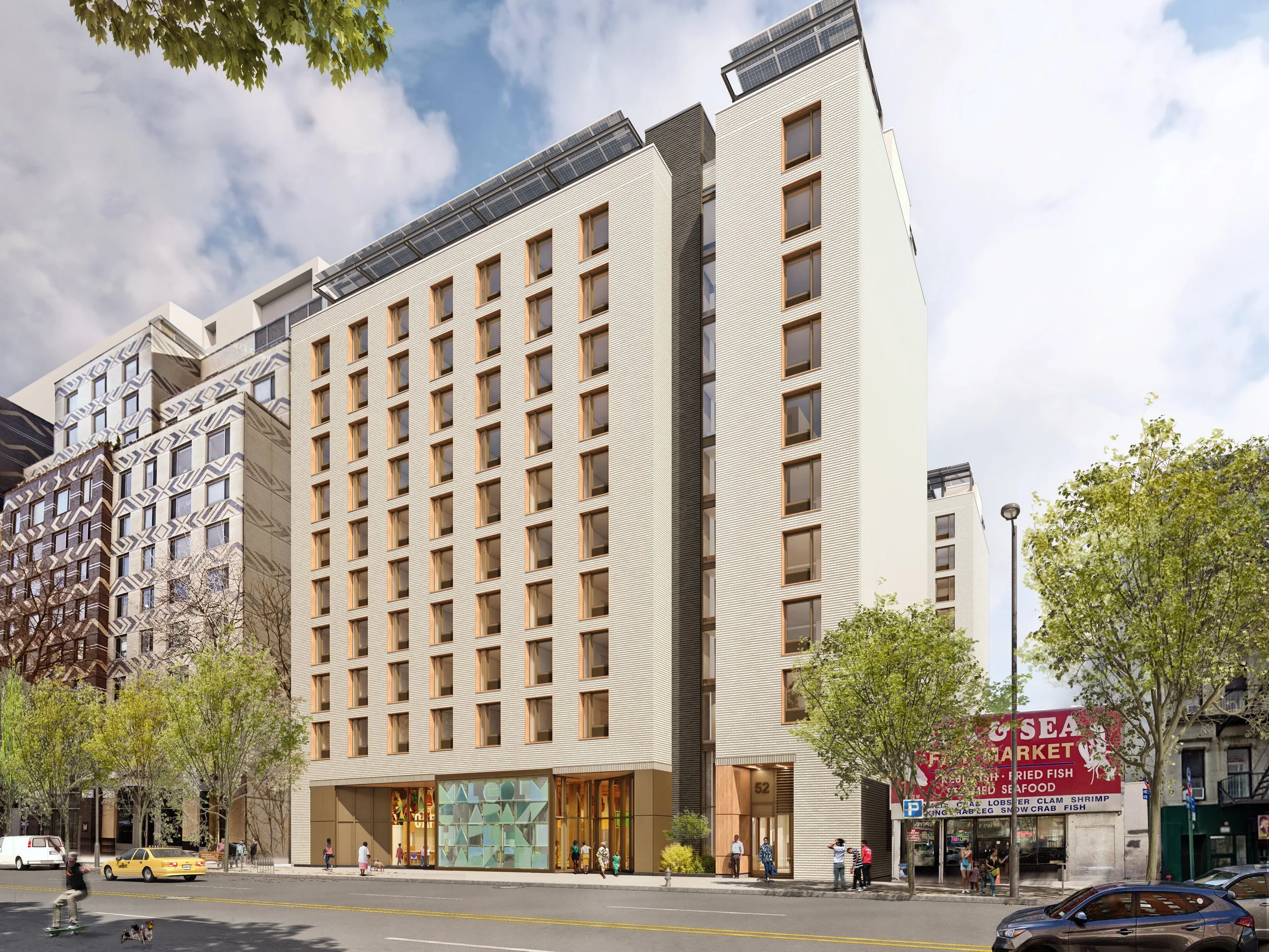
Think! is proud to announce that the Malcolm Shabazz Harlem Plaza project in Harlem, New York has been awarded in Round 4 of New York State Energy Research and Development Authority’s (NYSERDA) Buildings of Excellence, winning the distinguished project award and a $1 million development grant. The program rewards the design, construction and operation of clean, resilient and carbon neutral-ready multifamily buildings.

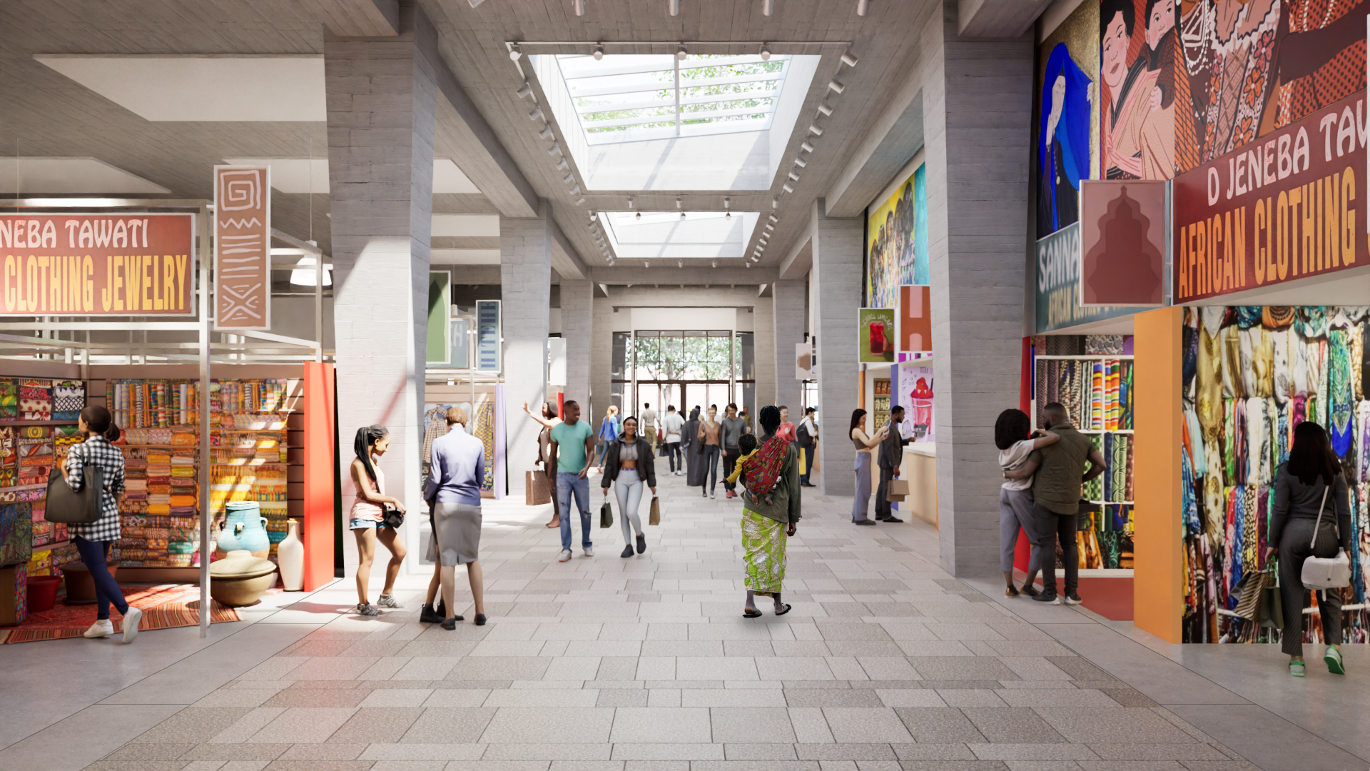
Designed for the Malcolm Shabazz Mosque Development Team and Procida Companies, the project includes 109 units of affordable housing across two buildings, a central landscaped garden for the residents, and provides an indoor home for the landmark, currently open air, seasonal Malcolm Shabazz Harlem Market; an iconic destination in Harlem.

The new market place will function as a local business incubator and showcases West African crafts, traditional clothing, goods and food. The market hall which spans West 116th Street to West 115th Street will act as a pedestrian arcade at street level between two city blocks, and will create a bustling ‘spine’ that activates and provides connectivity in the neighborhood. The two new 9 story buildings above the market will offer homes that conform to the City’s Extremely Low and Low‐Income Affordability (ELLA) criteria. 

Think! is collaborating with the MEP and sustainability team at Ettinger Engineering on mechanical innovations including newly efficient airtight packaged terminal heat pump technology utilizing low global warming refrigerants. Healthy comfortable spaces provide co-benefits for the residents through fresh filtered air, corridors and common areas filled with daylight, quiet spaces, and outdoor recreation.  The building’s electrical requirements will be supplemented by rooftop photo voltaic arrays.

The project will also implement Passive House design principles which increase energy efficiency up to 90% for heating energy and 75% in overall energy in comparison to traditional buildings. The choice of building materials will reduce embodied carbon by approximately 10% through the use of recycled brick façades. The energy and sustainability performance of the building will meet Energy Star, Enterprise Green Communities, Indoor airPLUS & Fitwel certifications.

The main West 116 Street entry is articulated by a grand 16 foot high glass art wall that will act as a beacon to identify the market. It will be commissioned to a culturally relevant artist or collaborative. The aim is to create an iconic piece that will continue to celebrate and elevate the landmark market and become a meaningful legacy in the community.

With today’s climate urgency, The Malcolm Shabazz Harlem Plaza project strives to address the most urgent imperatives by providing social justice, equity, resilience, and healthy environments. It will provide a home to the neediest and a year-round bustling urban gathering place for an iconic and important cultural asset, the Malcolm Shabazz Harlem Market.

Why Color?


Jack Esterson
Permalink

We recently designed a pair of affordable residential buildings in the Bronx for Catholic Charities. A senior director there who was our day-to-day contact, Drew Kiriazides, was a highly educated, empathetic and thoughtful man who dedicated his all-too-short life to make the City a measurably better place for its citizens and neighborhoods. I admired him greatly. During the design process, we had many fascinating and unexpected conversations about urbanism and design, and the assumptions we make about poverty, assumptions Drew was always questioning.

My most memorable of our talks, surprisingly, was about color. Up until then, our building exteriors integrated color into the facades, with accent panels, glazed brick, or graphics. Sometimes there would be more than one color or material in contrast with the overall background, creating a polychromatic mosaic meant to delight the eye in an otherwise gray urban landscape.

Why color? Well, for me at least two reasons. My earlier background as a visual artist always skewed me towards color. Later, as an architect, color became an inexpensive path towards vibrancy. Or even happiness. Blue cost the same as gray. Our under-funded non-profit clients embraced the notion. It became a hallmark.

But back to Drew. When we presented our colorful facade options, he was pensive for quite a long time. And then he finally asked, politely, “Why color?” What is it with you architects? So much color everywhere!! I was stunned. How could anyone be opposed to color anywhere, anytime? What?

He goes on to explain. Wandering through New York's poorest neighborhoods, they are awash in buildings with blue, orange and yellow panels, materials, canopies, graphics and entries. One building has more than the next. But try walking down Madison Avenue, or a more monied part of chic Brooklyn. A colorful accent panel is nowhere in sight. The buildings are clad in low-luster materials of creams, grays and bronze, waiting for Calvin Klein or Hugo Boss to move in. Color be gone!!

So then what is our culture saying here, manifested through the well-intentioned hands of us urban architects? Why bright colors for low-income families and subtle beige tones for the wealthy, like well-curated symbols of an understated privilege and taste? Is there some unspoken or unconscious need to cheer people up as they approach their subsidized rental, looking up towards our gorgeous rainbows and think, “Maybe life's not so bad after all, when there's so much color in the World!”, as we remain oblivious to the unintended condescension.

I felt an inner shift, and we returned with facade designs devoid of bright colors, instead relying on the natural tones of brick, metals and woods. The subject matter became about form and proportion, and different ways light and shadow affected these surfaces - late afternoon sun bathing a beautifully textured brick as the surface glowed into dusk. Only at the main entry did we bring in a welcoming wood wall, a very special moment of color. Once.

Classic, muted elegance for everyone, working well with the existing urban fabric, not contradicting it. For the same price. We still use color, of course, in our design work, but I have never thought about poverty and color in the same way since then.

In gratitude to my friend and colleague Drew Kiriazides, and his never-ending questioning, this essay is dedicated to his memory.

Think! Moves Forward With ShareNYC Project


Isabel Ling
Permalink

Think!’s proposal with Ascendant Neighborhood Development and Ali Forney Center has been selected by NYCHPD as a part of its shared housing initiative, ShareNYC. Our project combines social services and four duplex shared units as well as one simplex shared unit affordable to low-income households.

share-nyc-ascendant.jpg

Jack Esterson's Brooklyn Brownstone Featured in Brownstoner


Isabel Ling
Permalink

An inside look of architect, Jack Esterson’s, brownstone.

An inside look of architect, Jack Esterson’s, brownstone.

When not hard at work at Think!, partner Jack Esterson is an ardent collector of mid-century Danish furniture and art by local Brooklyn artists. Recently, he gave a tour to Brownstoner of his Clinton Hill brownstone, where these two passions come into conversation. Click the image above to read the article and learn more about the design choices that went into creating this beautiful home.

Blue Buildings


Jack Esterson
Permalink

I’ve noticed something going on in our hometown, New York City, for some time, and I'm going to call it the blue building syndrome. The buildings are not really blue, but they look blue, a very light cool blue, they are huge and they are going up all over town. They are sleek, minimalist, elegant, expensive and rather bland. They are the default setting today for large-scale commercial development by the largest developers around. And the big architecture firms are falling in line producing them, including such distinctive names as Diller Scofidio & Renfro and Fumihiko Maki. Go down to the re-built World Trade Center or to Hudson Yards. Its as if someone designed the perfect glass curtain wall system and everyone agreed its the thing to do, which leaves only the building shape as the variable - with their straight lines, or tapered walls, or curves, or even tilting towards collapse. The blue-ness comes from the glass reflectivity, and the walls blend into the sky in a way that makes them almost disappear, as if apologizing for existing. They take on an ephemeral quality, and a lightness that is somehow pleasing and stultifying at the same time. I would say that it began right after the attacks of 9/11.

Blue Building_Jack Esterson (1).jpg

Maybe this is OK. If one looks at old photos of the Lower Manhattan skyline in the 1940s, its a marvelous sprouting of consistent limestone spires. I think its the consistency of tone and the impossibly narrow towers that made it so breathtaking, and unlike anything that came before. So maybe vast clusters of the new blue buildings will be like an eruption of quartz crystals, a new glazed version of that old Lower Manhattan. Or maybe not, if the next thing will come to be before such a thing can ever materialize to critical mass.

Modular Construction Meets Design That's Just Right


Tani Sevy
Permalink

We have been fortunate to have had the recent opportunity to work on a number of modular residential projects.  These have ranged from small condominium buildings on infill sites in Manhattan to a recent proposal for a 160 unit affordable housing project on an open site in East New York, Brooklyn.  We’ve come away from these projects impressed with the possibilities this type of construction offers in terms of quality and speed of construction and we have also learned a number of lessons that will help us improve the process of designing modular projects going forward.  It appears that modular construction is on the cusp of much wider acceptance with a larger group of dependable manufacturers serving the New York City market.

Please take a look at a recent article from the New York Post about Think! and modular construction.  Just click on the image below.

Think! Wins Brownsville RFP


Tani Sevy
Permalink

Exterior_1.jpg

Think! is excited to announce its Glenmore Manor Apartments as the chosen competition winner as part of New York City’s HPD Brownsville Plan. Along with the African American Planning Commission, Inc., Brisa Builders, and Lemle & Wolf; Think! designed a compelling building including 230 affordable homes for low income households, ground floor commercial space, and supportive spaces for young business developers and entrepreneurs.

Exterior_2.jpg

Beautiful Freeways


Jack Esterson
Permalink

Last year I was driving through Los Angeles with friends. I live in New York City, and don’t own a car, but have always been intrigued by LA car culture, and how it has shaped the city. I never really thought much about their freeway system except for the legendary horror stories of 12 lanes of bumper to bumper standstill traffic, featured so often in movies. But after years of taking New York’s highways, I realized how beautiful they can be in LA.  Why is that? Why so lovely? A freeway lovely?

19DFE5B8-84FF-44AD-BEE0-7BDD16277873@columbus.rr.com.jpeg

The grandeur of these poured concrete curving structures seems to celebrate the very idea of mobility, and their utter simplicity and power of form strike me as something Le Corbusier might have designed, or derived from some great temple at Luxor. While New York celebrates commerce though the invention of the skyscraper, beautiful spires marking the city like mediaeval churches, our highways seems to be a complicated tangle of steel, concrete and bad signage. They are a means from point A to B but hardly enjoyable to be on and one can’t wait to get off, and back into the civilized City. They are in opposition to New York, while in LA they are of the city. 

3CD8A105-E63F-420A-8632-0FF245027330@columbus.rr.com.jpeg
F9E02529-D389-4E9B-941E-F17349098287@columbus.rr.com.jpeg

I wonder why these freeways in LA appear so lyrical to me. Maybe it’s because the city is so much about the automobile, and when a city inhabits an idea so fully, the design it manifests is inevitably compelling.  Or did enlightened engineers take over at the local transportation department there at some point, or a mandate came from up high about how pure engineering equals beauty, or something? Or was it a larger idea of modernity or the zeitgeist of the 20th century metropolis that took hold when these roads were built? They are so compelling that the architecture firm Coop Himmelblau designed a high school hard by the Hollywood Freeway that looks to me to be homage to the freeway system. It seems that only in LA would that ever happen.

BAFA6AC3-F41D-4B12-98CD-F83C8E1B0A6A@columbus.rr.com.jpeg

Affordable Style


Jack Esterson
Permalink

New York City is awash in new residential building projects known as Affordable Housing, driven by Mayor De Blasio's push for 200,000 new or preserved affordable apartments and the need for middle class and lower income people to remain in the City. Architecture firms in NYC are building entire practices around this mandate. For years, actually, large swaths of the Bronx and Brooklyn are being rebuilt with new, publically financed structures. Due to various forces having to do with finances, regulations and a shear lack of imagination, these buildings blend together into a bland, predictable housing stock that adds little to the local community except for clean and decent places to live, no small task.

Picture2.png

But I ask, why does New York’s affordable housing have to look “affordable”? The attributes of this “style” are typical – the cheaper “jumbo” red brick, the horizontal stripes of contrasting brick, and the same relentless under-scaled windows. It has a mean-spirited look and its everywhere. It is creating a city of no character, no identity except an identity of scarcity.

IMG_5216.jpg

I believe everyone deserves inspired and innovative design and it’s our job as architects to test the limits of what can be done in this building type. Otherwise we are conveying the message that lower income people don’t really matter, and neighborhoods in outlying areas don’t matter either, and they do. With some ingenuity, thoughtfulness, and most of all, empathy, we can raise the bar of affordable housing design significantly, as it is in many other parts of the country and the world. Being in the midst of this building type now, we at think! understand how hard it is to negotiate innovation and quality within the confines of public agencies and their demands to maximize unit count and minimize construction budgets, all within an over-heated construction market. We understand the pressure that puts on architects to produce the same predictable outcomes – the lowest common denominator. But we can’t settle for that. We have to do better. Achieving quality and innovation in affordable housing is really hard – but is not a factor of high budgets. It’s a matter of imagination. And that's our job.

Waterfront Development Wins SARA Design Award


Martin Kapell
Permalink

We are proud to announce that we won the Society of American Registered Architects National Design Award for our waterfront complex plan in Newburgh, New York, in the urban planning category. This multi-building residential complex, with its landscape components and new ferry terminal, is meant to help economically revive this old Hudson river city.

NEWBURGH Rendering (1).jpg

REACT Center Opens


Martin Kapell
Permalink

On June 16 the Roosevelt Educational Alcoholism & Counseling Treatment (REACT) Center, designed by Think!, opened its doors to the community. Director Carol Jobson praised the new Center's design, filled with natural light, color and natural materials, as being a reflection of renewal and hope for their clients in outpatient treatment. The project included a total interior and exterior renovation of a dark and dilapidated warehouse.

REACT Photo_Final (10).jpg